Yesterday, we reviewed Starters by Lissa Price. Its cover looks like this:

First Impressions
The first thing I think when I see this cover is a combination of "technology" and "everyman." The technology comes immediately from the circuit-board background and the techy-looking font for the title and tagline ("Survival is just the beginning.") The "everyman" thought comes from the stark white of the girl's skin and hair, and the fact that her eyes are two different colors, implying to me that anyone could take her place: she could be anybody.
Sure, some of this was probably influenced by the fact that I knew the summary of the book, because I chose it for us to review.
Read the Book
The relevant information from the book is as follows: Callie is forced by circumstance into offering herself to a company that rents out the bodies of young people (Starters) to Enders (old people) who want to put their mind in a young body for a while and go do fun, young-person stuff.
Afterwards
The "technology" thought still stands, because the body rental is accomplished by putting a chip in Callie's neck, through which the mind of an Ender can enter her body and control it.
The blank slate that is the girl on the cover still makes sense, too. Callie doesn't know anything about the people who could be renting her body. She doesn't know what they do while they're her, or where they go or what they say to whom.
I will amend the idea I had about the two differently-colored eyes, though, because the turning point in the book is when Callie's mind returns to her body in the middle of a rental. So it's like she's two people in one body.
Alternate Covers
(I cannot copy/paste all of these images, but they can be found at this page of Lissa Price's website.)
The Dutch cover removes the electronics-style background, emphasizing the tabula rasa girl instead of the chip.
The German cover uses a black background and a ghostly outline of the girl, with a shadowed face that makes her look more like a shell (which is a darker way of demonstrating that anyone could be inside that body).
 |
| The German cover |
The Indonesian cover is completely different, and I can only attribute it to cultural differences. It is a simply illustrated girl facing away (so you see the back of her head). The point of hiding her face or identifying features is preserved, and the background is made of blue-gray geometric shapes, hinting at the technological influence.
 |
| The Indonesian cover |
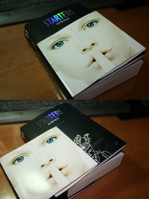
The Korean cover brings back our blank white face, but she's holding up a finger to her lips, as if to shush us. There is a major secret in the book that she is carrying around (sort of) so this makes sense, in a way. The circuitry designs are in a black band at the top of the cover, instead of behind the girl. She also has two bright blue eyes; I think they should have stuck with the two differently colored eyes to emphasize the dual minds inside one head, but maybe that means something I don't know about in Korean culture.
 |
| The Korean cover |
The UK cover is almost identical to the US cover, but the UK paperback cover (bottom of the page) has the black background and ghostly blue highlights of the German cover. It looks considerably scarier than the white-and-blue backgrounds, which I think is appropriate, because there are some scary thoughts in this book.


I agree with a lot of what Alex says. You get a very technilogical feel from the book. I had more of the thought that it was like an android. It makes sense, because what is an android but both technology and human combined? It's very much like what Callie is.
The thing I like best though, after I read it, I could pinpoint exactly where in the book the cover art fell. It was a significant point and I liked that I could so easily relate to the cover art. I enjoy it when the cover so directly relates to the book. That doesn't always happen.
No comments:
Post a Comment