Showing posts with label By Its Cover. Show all posts

Saturday, November 16, 2013

RIP BIC


We will no longer be posting "By Its Cover" posts on Saturdays. From now on, if we have something to say about the cover of a review book, it will be said in our Friday reviews.

If you have strong opinions one way or the other about the disappearance of By Its Cover, feel free to let us know about those opinions in the comments below. According to our blog statistics, they are the least popular of our posts, and this choice will free up Saturdays for other interesting things in the future.

Also, we'd love to know what you thought about it and your favorite By Its Cover, if you had one.  

Have an idea for a Saturday post?  We'd love to know that too.

Saturday, November 9, 2013

By Its Cover: An Old-Fashioned Thanksgiving by Louisa May Alcott


This was the cover I had for the book (Alex's may have been different) and it's pretty straightforward.  In fact, it a direct replica of one of the pictures IN the book, just flipped.

However, it gets the point across.  Thanksgiving, family, happiness, all that jazz.  Considering how kind of simply and holiday themed this book is, I think it's a good cover.

Saturday, November 2, 2013

By Its Cover - Ashes by Ilsa Bick


I actually really love this cover.  It looks like of like a  finger print to me, which I think is the point.  It's a book that has a lot to do with identity and genetics, which a finger print kind of represents.  Also, the idea that each person reacted differently to the pulse.  It's that idea that no two people are exactly the same.

But then you look closer and it's OMG CREEPY FACE!!!  Which, you know, works well because of the Zombies.  And Bick's zombies are zombies that LEARN, which is kind of different for zombies (plus, let's not forget the addition of super powers for regular people.)

It's a great cover and I think it works wonderfully with the book.

Everything Cassy said is basically what I had to say about this cover. The only thing I have to add is the color scheme... "Ashes" obviously evokes the idea of grays and black, so those are our predominant colors, with a touch of red because red and black is the horror palette. Very effective.

Saturday, October 26, 2013

By Its Cover: Scary Stories to Tell in the Dark


I've already said a lot about the illustrations in these books, but today is the last day I'll be talking about them (probably).

As far as the cover goes, I think they're equally effective. (You didn't see that coming, did you?) I actually really like Helquist's cover (on the right). It illustrates what is probably my favorite story of the whole book. You've probably heard it before in the form of an urban legend. Basically, some kids are talking about how it's dangerous to stand on top of a grave because the inhabitant will reach out, grab you, and pull you in. One girl says she isn't scared, so her friends give her a knife and tell her to go stick it in a grave to prove she stood on one (because going to the cemetery with her and watching her do it would be... well, it wouldn't give us a story, now, would it?) So she goes, she stabs the grave, and turns to leave but she can't because something's holding her back. She's found dead the next day... because she had a heart attack thinking a dead person grabbed her, when really, she had just stabbed the knife through the hem of her dress and into the ground.

I like the creepy nature of the cover on the left, too, and I like Gammell's style in general. Also, Gammell's cover is iconic. You can easily identify that series by that cover. Helquist's on the left would blend in on a shelf (especially one dedicated to children's horror) and not stand out as much.

But, when all is said and done, based entirely on the cover, I like them both pretty equally.

Honestly, I like the grave cover better.  It's creepy and it's scary and it's got just the right amount of macabre in it.  I like when covers actually illustrate what's going on in the book.


The cover on the left still has a certain amount of creepiness to it, but honestly, the pipe in the skull's mouth... just makes me kind of giggle, which I think is kind of the antithesis of what they were going for.

Saturday, October 12, 2013

By Its Cover: Can You Ever Forgive Me?


Despite my opinion of the content of this book, I actually quite like the cover. I like that the font is Courier, also known as "the typewriter font," because Israel's forged letters were written on a typewriter. I like the red proofreading pencil underline, because it fits the theme, too.

I particularly like the author line, with the names of people she forged letters from crossed out and her real name signed at the bottom. (I learned from this book that a TLS is a "typed letter, signed" and that's the look we have here on the cover.) I thought that was clever (more clever than anything I read in the book, anyway).

My copy was hardcover with a dust jacket. The dust jacket had a lovely bumpy texture like an aged letter might, and it added that little bit extra that made me want to read this book (although I changed my mind after having done so).


Saturday, October 5, 2013

By Its Cover: Going Bovine


It's the last day of our anniversary week, and we're talking about the cover of Going Bovine (which, by the way, you have until midnight EST tonight to try to win a copy of!)

I like the cover, because it makes you think, "Huh?" Why is that cow carrying a garden gnome? Why is the gnome wearing sunglasses? What does the cow's expression mean? I'm sooo confused. I feel compelled to read this book to understand what's going on here.

And the title, too... "Going bovine?" What does that mean? Is it like "go stupid" in the club? Is that what we're doing? That cow doesn't look like it's at a dance party.

It's simple, it's effective, and it's interesting. What more could you want?

I agree with Alex about the cover.  In fact, the first time I was reading this book, my roommate looked at it and said, "are you reading a book about a cow?"  And then I had to explain to her why there was a cow on the cover.

So it's a funny cover that is very effective, as my real life evidence suggests.

Now, go ENTER OUR CONTEST to win this book.

DOOOO EEEEETTTTTT!!!

Saturday, September 28, 2013

By Its Cover: And Tango Makes Three


Do I even have to tell you how cute this cover is? Penguins in love, with the happiest little fluffy baby penguin in front of them. If that isn't the perfect picture of a family, I don't know what is.

Picture book covers have the benefit of making it really obvious what's inside the book, because they're illustrated by the illustrator of the rest of the book, and they often are a copy of a page within the book. This image was well selected, well drawn by Henry Cole, and is as inoffensive as a "controversial" book can be. (And yet, it has been on the top ten most challenged books list 6 of the 7 years since it was published. Who wouldn't want fuzzy little Tango on their bookshelf?)

Everything about this cover screams cute.  Hugging penguins, a cute, little, fluffy, happy penguin.  I also really like Cole's style.  There's just something about the way he uses colored pencil that makes me feel warm fuzzies inside.  Maybe it's the topic.  Maybe it's because you just can't help but look at penguins and go, "awwwwww".

Really, there is nothing controversial in this book.  Yeah, ok, they're homosexual penguins.  But they're so cute!  This book is definitely going to populate my future child's bookshelves.

Saturday, September 21, 2013

By It's Cover - I Can Lick 30 Tigers Today by Dr. Seuss


Like Alex, I thought that "Lick" meant that he was physically going to lick the tigers with his tongue.  I was kind of disappointed when he didn't, and the cover doesn't really reflect what he's planning to d.  I mean, ok, he's holding his fist up, but I only realize that NOW that I know what he was talking about in terms of the word "lick."

It does have tigers though, and they're looking pretty mean.  However, none of the other stories are reflected in the cover (in fact, you can barely see the "and other stories" on the cover of the book."

The Cat in the Hat also looks oddly excited to go beat up 30 tigers.  

The cover doesn't even do anything to grab my attention.  I mean, if I were to be looking through a stack on Dr. Seuss book, this wouldn't necessarily catch my attention because it just seems a weird replica of all his other book.  The whole cover is just kind of a disappointment.

This is typical Seuss... the drawing style, the image taken directly from a page of the book to use as the cover, the font. If you were browsing the shelves looking for Seuss, this makes it easy to find, but if you were looking for something unique, you'd probably skip right past it.

I do find it interesting that, although his books are decades old, publishers never - to my knowledge - revamped them with new covers. I think it's because they're playing the "classic" angle, and also because it's a rare instance of an author doing his own illustrations. It's iconic, so they can't very well change it. But that doesn't make it any more interesting.

Saturday, September 14, 2013

By Its Cover: Coraline


I mentioned that the novel was illustrated by Dave McKean, and that I really like McKean's take on Gaiman's work. But - and I'm in direct contrast with Cassy's review yesterday with this - I prefer P. Craig Russell's version this time around.

Part of the reason I think I didn't much care for the novel version is that I'm bad at remembering visual details when they're... not visual. I have a good visual imagination, I think, but only when I'm in charge of what I'm imagining. When someone else tells me "so the Other Mother looks like this" and I keep reading, I forget important visual details almost immediately. Russell's illustrations remove that issue for me. McKean's were suggestions; Russell's are the story. (Which is what each illustrator's job was; I'm not saying McKean did a bad job... he did what he was supposed to do.)

As Alex mentioned, we're in direct contrast with this story (which, let's face it, is why you read the blog.)  I don't really like Russell's cover.  Mainly because I'm not a fan of his Coraline, but it just doesn't scream scary to me.  McKean's cover I think really gets the other worldly-ness of the story.  It's this world that's a copy of ours... but not quite.  I just think that the Coraline novel is a much better portrayal of that idea.

(She looks like a person... but not quite like a person.  Also, the hands on the book cover?  WAY creepier than the bats on the GN cover.)

Saturday, September 7, 2013

By Its Cover: The Girl with the Dragon Tattoo


Did you know there was a dragon in the background of this cover? I seriously didn't, despite having seen it dozens of times over several years, until I just copy/pasted it right here in this post. That book has been sitting next to my couch for over a month and I didn't realize that. So... it's not terribly effective, I guess.

It is, however, very recognizable, and I could point it out from across the room.

Design-wise, it's well done: bright cover catches the eye, simple text makes it easy to identify, and (incredibly) subtle cover art makes it unique without being overly busy. And it lent itself well to a series:


Each cover is clearly unique while simultaneously obviously part of the same group and equally recognizable.

Cassy, super late in the game today.  But now it's like a SURPRISE entry on your Saturday.

I, like Alex, didn't realize that there was a dragon in the background until she pointed it out RIGHT THEN.  I'm still not convinced that they're all like that.  I think it's a fluke.

However, it is a very recognizable cover and because of the nature of the color of its cover, easy to pick out on the shelf.  I mean, if I see a bright yellow spine on the shelf, I'm going to automatically assume that it's The Girl With the Dragon Tattoo (and I would probably be right.)

I like that all the covers fit together too.  I think cover two and three fit more with the book titles (book two LOOKS fiery, and book three gives you a feeling of a hornets nest.)  Like Alex pointed out, the design on the cover of book one is just a little too subtle for my taste.

Saturday, August 31, 2013

By Its Cover: Super Boys

Review: 'Super Boys: the Amazing Story of Jerry Siegel and Joe Shuster' Returns to Comics' Original Sin Cover Image

You can't see it very well in the image, but the cover has that dotted fill you get in old comic books before they changed the printing method (yes, you still get it sometimes depending on who's printing your comics). Obviously, the cover (the framing, the sketchy - not "creepy" sketchy, but literally "looks like it was sketched" - Superman at the top, the dotted fill, the predecessor-to-Comic-Sans font on the subtitle) is meant to look like an old comic book.

The only thing I would change if I were any part of designing this cover is that I would give "Super Boys" a starburst like it's an onomatopoeia (you know, like "BLAST!" or "BANG!" or "ZOOM!") Though, come to think of it, that might be a little more Silver or Bronze Age than Golden.

I think the cover was well done.  I like the comic book feel that it had, that it was Superman without being all about Superman.  I think it's a fun, and bright, cover.  The cover is what originally led me to decide read it.

I think the thing I like most, however, is the city.  It could be Cleveland.  It could be Metropolis.  It manages to be every city, and no city, that is important in Siegel & Shuster's lives.

Saturday, August 24, 2013

By Its Cover - I Am Number Four


The first time I saw this cover I thought sun, mostly.  Off planet (mainly because I had read the inside flap and knew there were aliens involved.)  It just seems bright, but really ominous at the same time.  Even the title, "I Am Number Four" doesn't sound good.  It sounds like it's a death sentence (which, I guess since they killed off 1 - 3, it is kind of a death sentence.)

After reading it, I realize the brightness of the cover is probably supposed to signify Four's growth of powers.  He gains the ability to make his hands light up and be impervious to fire and I kind of think that the cover was more going for that then the, "We're all going to die" aesthetic.

But I'm not totally writing the "we're all going to die" thing off.

I had vaguely paid attention to the trailers when the movie came out, so I knew there were teenagers and superpowers involved, but that was the long and short of it.

The cover looks, at first glance, angry and exciting and action-y. There is danger (red!) and action (yellow!) and more danger (fractured-looking text!)

A second glance only confirms all of this. "Three are dead. I am number four." Foreboding, no?

It's a fairly nondescript cover that could be for any of a number of books (particularly in the YA sci-fi family) but I think they get a little better as the series continues. Just look at The Power of Six and The Rise of Nine:


Saturday, August 17, 2013

By Its Cover: Beautiful Boy


I didn't pay close attention to this cover before I started reading the book. (For such a visual person, it's surprising how often that happens to me.) If you had asked me what it looked like, I would have just said it was a white background with plain text in the middle. I didn't really notice the jumping boy off to the side.

When I did notice it, though, I thought it was good design. You don't see a face, so it could be anyone (though it's pretty obvious it's supposed to be Nic). He clearly looks joyful, and young, which is something David likes to remember: the simple happiness of his kid's youth. Except the photo does that without sounding really flowery like I just did.

I like the cover a lot.  I like that the kid is off to the side, running, because I think that's exactly how David Sheff felt: Nic was running away from him.  His childhood disappear, NIC disappeared and became this elusive, unreachable thing.

Saturday, August 10, 2013

By Its Cover - Richard II by William Shakespeare

Welcome to a special edition of By It's Cover.  BY IT'S ACTOR!!!

Really, let's face it, there are a million and one covers to Richard II.  Annnnndd, since it's 10 PM the night before this post is due to go up and neither I, nor Alex, has actually written up the BIC, it probably means we're not really looking forward to it this week (because there are a million covers... and they're all kind of boring.)  So this week, I'm just posting a bunch of pictures of actors who have played Richard II (mainly because there's no one around to stop me.)

Alex may join in if she likes with any actors I missed... or maybe actresses.


This is Ben Wishaw.  He played Richard II in a very recent BBC version of the play.


Derek Jacobi played Richard II in 1970.  Probably a little old for the part, but very distinguished, nonetheless.  He was also on an episode of Dr. Who in 2007.


Mark Rylance portrayed him in 2003.  Again, Richard was very young, but I'm getting the feeling Hollywood is missing that point... as they usually do with these kind of things.


Waaaaiiiit a second, that's a girl!  Indeed it is!  Fiona Shaw (AKA Aunt Petunia), played Richard in a 1997 version of the play.  I don't know if it was any good, but it's certainly an interesting take on the whole thing.

At the risk of sounding lazy, I'm only going to add that Cassy did a great job and I have nothing to add!


Saturday, August 3, 2013

By Its Cover: Cloud Atlas


I really like the cover on the left, just because it's pretty. I'm not sure about how well it reflects the story (stories) of the book, but it's appealing and I would absolutely go pick it up off the shelf to look at it more closely.

The one in the middle is the one I have. I didn't look at it very carefully for a long time, but then I realized that there are six images... because there are six stories. Pretty self-explanatory (but still not nearly as visually interesting to me).

The cover on the right is quite obviously the movie poster version. I very clearly remember when the movie came out, and the trailer was big and beautiful and full of actors I think highly of... and I couldn't figure out what the story was, and it bugged the hell out of me. Now I understand why (because there isn't one story) but it still annoys me. Even Tom Hanks can't make me feel better about it, and he's awesome.

I had the Kindle version, this time around, so the cover had very little effect on me.  The first cover that I saw, however, was the middle one.  Unlike Alex, I got it right away (that the pictures corresponded to the stories) and thought it was very apropos.  

As much as I love my kindle and love that I can get the Kindle version, I do wish that there was more of a "cover."

Saturday, July 27, 2013

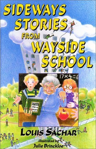
By Its Cover: Sideways Stories from Wayside School


I like this cover because it's very cartoony, which I think really fits the book.  It's a silly, ridiculous, non-sensical book, so I think the cover really reflects that by making it that colored in look.  And it gives you some basics about the book.  The cover reflects the first story, with the teacher that would transform them into apples.

You can also see the school in the background, which is SO TALL that it's reaching the clouds.  It's over-exaggerated, just like the entire book is.  The cover also has bright colors, which really draw your attention.  I think the yellow font is probably my favorite.

Overall, a good cover for the book.

There have been several covers for this book, but they all have the same general feel: cartoonish, fun, weird. And that's what this book is.

Saturday, July 20, 2013

By Its Cover: Rechenka's Eggs


This is a wonderful book cover. It tells you everything you could want to know about a picture book before you crack it open. The drawing style is right there on the cover, and for some kids, that's enough to make or break a picture book. (I never liked books drawn with too much realism; I like bold lines and bright colors, what can I say? I'm a Mondriaan fan.)

The font (and the name "Rechenka") lends itself to the Russian culture theme, and the two main objects in the story - the goose and the eggs - are right there, saying "this book is about us."

There's something so wonderful about how straightforward a picture book's cover can be (partly because the story is short and can usually be summed up in one image, and partly because it's already illustrated and therefore an image is a great way to introduce it) and I appreciate that.

I agree with everything Alex said.  This is a wonderful cover and it's so COLORFUL.  Let's face it; as kids, we're attracted to bold, beautiful colors.  And the more interesting a book cover is, the more likely I was as a kid to pick a book up.  (Ok, I'm still kind of like that as an adult, but at least I read the descriptions now.)  The eggs on the cover draw the eye, and the detail keeps it there.

Saturday, July 13, 2013

By Its Cover: Le petit prince


Even if you've never read the book, you've probably seen the cover. (At least, you did yesterday, if not before.) It hasn't really changed in the 70 years since it was published.

That is, of course, the titular prince on the cover, and he's standing on his planet (which is to scale... it's actually very small). Most versions of the cover have a blue background to make it clear that he's in space, on his little planet.

It's a fairly direct and literal cover, and I'm cool with that. I think the hat/boa picture might make a better cover (see my review in yesterday's post) but this is still fitting.

I don't have much to add to Alex's critique.  Mine had the blue background that she speaks of.  Also, I like the font.  It's very whimsical and this is a whimsical book.

Saturday, July 6, 2013

By Its Cover - Shiloh


This book cover I think really shows it's age.  It's that "draw reality" look that was very popular during that time.  It does get the point across (reminds me of the Dear Mr. Henshaw cover.) but it's very 1990s.


These are both updated covers, and I think they're a lot better, especially the one to the right.  It's a lot less complicated, and it has a REAL PUPPY on the cover, which is always a winner.  It's simple, to the point and way less cluttered than the other two.

PUPPIES! That's basically what I think when I see the newer covers. The one on the right looks truer to the story (the one on the left is a little too happy to encapsulate the mood of the entire book) and the fonts on the right fit better (they suggest childhood, which is central to the story; it's a bildungsroman at heart, after all). The one on the left looks like it might be about talking animals going on an adventure, which is - obviously - not the case. (I also don't like the tagline; Shiloh isn't technically Marty's dog for most of the book, and the phrase "the classic story of a boy and his dog" does not entice me to read it.) The old cover was the reason I never wanted to pick this book up; a boy and a dog on a cover might as well be a flashing sign that says Sad Story Ahead.

Saturday, June 29, 2013

By Its Cover: The Laramie Project


I hadn't scrutinized this cover very carefully before I read the play. If you had asked me, while I was reading it, what the cover looked like (and didn't let me peek), I would have said it was blue and had white condensed text. While technically correct, that doesn't cover the meaning of the image presented on this cover.

Had I looked carefully at this image before reading it, I would have said they chose it because Matthew Shepard was found on the side of the road.

Without giving away one of the best parts of the play, I can tell you that Matthew Shepard's father made a statement at the trial of one of his son's killers. In that statement, he talks about how Matthew was not alone on the side of the road like everyone said he was. (He had his old friends of nature like the sky and wind, and God.) This image encompasses that idea quite well, and is probably the real reason it was chosen.
 
 
I think it's beautiful and pertinent, and - like the story - it is both simple and deeply complex simultaneously.
 
I did not have the same cover as Alex.  This is what mine looked like.
 
 
It's dull, it's boring and it has absolutely nothing to do with the text.  I'm pretty sure it's from this one company that mass produces plays (cheaply), so none of them have fancy covers.  They all look like this, but maybe with a different colored cover (I had a couple that followed this pattern in college.) 
 
You can tell that these books are meant to be used by actors and actresses and such to learn their lines and not meant to be the forefront to the general public (which... is fine because, honestly, I don't really think the cast NEEDS fancy covers.  They probably just want to learn their lines.)