Showing posts with label illustrators. Show all posts

Monday, June 2, 2014

Illustrator Bio: Jon Klassen


We're reading The Dark by Lemoney Snickett this week, but since we've already done an author bio on him, I figured this week, we would take a look at the illustrator of the book, Jon Klassen.

Klassen has actually done a number of books that you would recognize, probably the most notable being This is Not My Hat (which, if you haven't read, you should because it's a cute, short, adorable, funny book.)  I Want My Hat Back is also another book that made a big splash, though it's often criticized that it's inappropriate for children.  (The bear eats the rabbit off screen at the end.)


Klassen grew up in Canada, going to school at Sheridan College.  In 2006, he moved to LA, where he currently still resides.  He did animation work on both Kung Fu Panda and Coraline.  You can follow his blog or his tumblr.

Saturday, October 26, 2013

By Its Cover: Scary Stories to Tell in the Dark


I've already said a lot about the illustrations in these books, but today is the last day I'll be talking about them (probably).

As far as the cover goes, I think they're equally effective. (You didn't see that coming, did you?) I actually really like Helquist's cover (on the right). It illustrates what is probably my favorite story of the whole book. You've probably heard it before in the form of an urban legend. Basically, some kids are talking about how it's dangerous to stand on top of a grave because the inhabitant will reach out, grab you, and pull you in. One girl says she isn't scared, so her friends give her a knife and tell her to go stick it in a grave to prove she stood on one (because going to the cemetery with her and watching her do it would be... well, it wouldn't give us a story, now, would it?) So she goes, she stabs the grave, and turns to leave but she can't because something's holding her back. She's found dead the next day... because she had a heart attack thinking a dead person grabbed her, when really, she had just stabbed the knife through the hem of her dress and into the ground.

I like the creepy nature of the cover on the left, too, and I like Gammell's style in general. Also, Gammell's cover is iconic. You can easily identify that series by that cover. Helquist's on the left would blend in on a shelf (especially one dedicated to children's horror) and not stand out as much.

But, when all is said and done, based entirely on the cover, I like them both pretty equally.

Honestly, I like the grave cover better.  It's creepy and it's scary and it's got just the right amount of macabre in it.  I like when covers actually illustrate what's going on in the book.


The cover on the left still has a certain amount of creepiness to it, but honestly, the pipe in the skull's mouth... just makes me kind of giggle, which I think is kind of the antithesis of what they were going for.

Friday, October 25, 2013

Review Me Twice: Scary Stories to Tell in the Dark by Alvin Schwartz


I was ridiculously underwhelmed by this book. It has been on banned books lists. It's scary stories for kids, which I usually love. It's classic to my generation, because I know several people around my age who remember it as being terrifying, or at least leaving an impression.

For the record, I read the version on the right up there. The one illustrated by Brett Helquist. (For more about the difference between the two, see my post yesterday about the illustrations.) I think that allowed me to pay more attention to the lackluster stories.

Perhaps as a kid, I might have found some of them more interesting and scary. But as an adult, I know all these stories. I've seen the Urban Legend series of movies, as well as Scream, and I attended my fair share of sleepovers back when I was a Girl Scout. None of this was new or interesting to me. (And if I recall correctly, none of it was actually scary back when I heard it the first time.)

And perhaps accompanied by Gammell's illustrations, the stories would have been more effective... but then again, his illustrations are effective all on their own; they need no accompaniment.

I can't help but feel like the only reason this book was on banned books lists to begin with was that Gammell's illustrations were too scary for some people, and now that it's been redone, that's why it dropped off the lists.

Hey!  Nothing like being late to the party.  Like Alex, I wasn't really that impressed with this book.  I vaguely remember reading it as a kid, but that's only because I recognized the picture and I have a good visual memory.

The pictures are sanitized from the original, but that doesn't mean they're still not scary.  Because there are pretty freaky looking.

I think the stories would be a lot scarier told by fires, in the dark, and out loud (kind of like the cover suggests.)

Thursday, October 24, 2013

Think of the Children!

No matter how old you are, you've probably noticed that kids used to be expected to be a little tougher than they are now. If you grew up in the 1930s, maybe you were expected to miss school during harvest season to help on the farm. Or you grew up in the 1950s, and you had to walk uphill in the snow both ways to school, or in the 1970s, when you didn't have any of this newfangled internet. Perhaps you grew up in the 1990s, when you had to wear neon sweatpants that made that awful swishy sound. Whatever "hardships" you had to endure as a child, it probably doesn't make you feel better seeing kids who lament having to use an iPhone that isn't made of solid gold, like some kind of animal.


My crazy ranting aside, there is ample evidence that a large number of parents have gone nuts in recent years trying to protect their children from all the perceived evil in the world. (To avoid upsetting any of our readers, I'll resist pointing out specific examples of ridiculous products marketed toward worry-prone mothers.) What we rise up against during Banned Books Week alone is pretty persuasive to that point. The reillustrated edition of this week's review book makes a pretty good case, too.


Those are the original covers to the Scary Stories books by Alvin Schwartz. They are illustrated in amazing, creepy, terrifying style by Stephen Gammell. In fact, I'd venture to say that these books wouldn't be half as famous (or as challenged) without those images. Here's a collage of some of the best ones:


Take a moment to really take those in. I'll wait.

...

Sufficiently terrified yet? I mean, maybe if you're one of the many people desensitized to violence and gore (have you seen any of the Saw or Hostel movies?) these aren't so bad, but to a little kid of an age befitting the writing in these books? That's horrifying stuff.

Which... and here's the crux of my point... is not a bad thing.

Isn't there an entire holiday, coming up next week, dedicated to scaring ourselves silly? Would haunted houses, games like Slender, and horror movies exist if we didn't like being scared? It's an adrenaline rush, and it's one that's easily adaptable to different age levels. Jumping out at someone and yelling "boo!" is fun for the whole family; Rob Zombie films are more suited to an adult audience. But people of all ages like to be scared sometimes.

And these drawings? This is the kind of scary that sticks with you. Kids eat this stuff up. Are there kids out there who shouldn't be exposed to this and can't handle it? Probably. But that's also the case with peanuts and bubble wrap. So maybe a little parental supervision is in order for certain little ones.

But the real problem here is that someone - I haven't a clue who (but my money is on the publisher) - made a decision to replace these beautifully creepy images with updated (read: sanitized) friendlier versions. Take a look at the comparisons below (found here):


The Gammell drawings, of course, are on the left, with the newer images on the right by Brett Helquist. I have nothing against Mr. Helquist or his work; I quite like his style, out of this context. In fact, he's the guy behind the illustrations to Lemony Snicket's A Series of Unfortunate Events books. But I know people who only remember reading this book as a child because they recall losing weeks' worth of sleep over Gammell's drawings, and I really don't think anyone's going to have the same problem from Helquist's illustrations.

Which means our kids are safe, once again, from anything too scary or weird or nightmare-inducing. But aren't nightmares part of growing up? I think so.

Saturday, September 14, 2013

By Its Cover: Coraline


I mentioned that the novel was illustrated by Dave McKean, and that I really like McKean's take on Gaiman's work. But - and I'm in direct contrast with Cassy's review yesterday with this - I prefer P. Craig Russell's version this time around.

Part of the reason I think I didn't much care for the novel version is that I'm bad at remembering visual details when they're... not visual. I have a good visual imagination, I think, but only when I'm in charge of what I'm imagining. When someone else tells me "so the Other Mother looks like this" and I keep reading, I forget important visual details almost immediately. Russell's illustrations remove that issue for me. McKean's were suggestions; Russell's are the story. (Which is what each illustrator's job was; I'm not saying McKean did a bad job... he did what he was supposed to do.)

As Alex mentioned, we're in direct contrast with this story (which, let's face it, is why you read the blog.)  I don't really like Russell's cover.  Mainly because I'm not a fan of his Coraline, but it just doesn't scream scary to me.  McKean's cover I think really gets the other worldly-ness of the story.  It's this world that's a copy of ours... but not quite.  I just think that the Coraline novel is a much better portrayal of that idea.

(She looks like a person... but not quite like a person.  Also, the hands on the book cover?  WAY creepier than the bats on the GN cover.)

Monday, September 9, 2013

Author / Illustrator Bio: Neil Gaiman and P. Craig Russell

The time has come, friends. We're reviewing something by Neil Gaiman, and you know I'm loving it. But there's a twist... we're reviewing it twice... twice. See, P. Craig Russell turned Gaiman's Coraline into a graphic novel, so we're reviewing both. But first things first; today is author bio day.


Neil Gaiman was born in Portchester, Hampshire, which is in England. He keeps a great blog at his website, and is an excellent Tweeter. He always wears all black, not because he's dark and brooding, but because it makes it easier to put together a matching outfit. His family is Jewish and Scientologist, but he is neither. He began reading avidly at the early age of four, and seemingly knew his whole life that he wanted to be a writer.


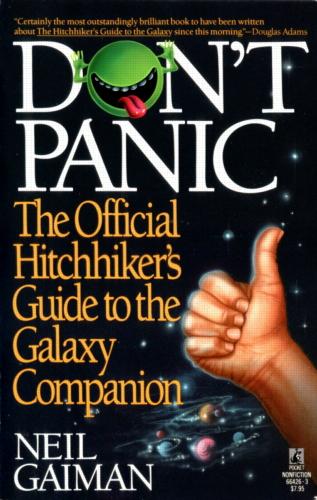
His first book was a biography of the band Duran Duran, published in 1984. He worked in journalism for a few years before writing Don't Panic: The Official Hitchhiker's Guide to the Galaxy Companion (1988).

Gaiman became friends with Alan Moore (who you heard about a couple weeks ago) and moved into the world of comic books. This is where he picked up and revived an old DC character, The Sandman, with his own spin.


I've discussed the Sandman series a number of times on this blog. It ran as a comic from January 1989 to March 1996 in 75 issues. It was one of the flagship titles of DC's Vertigo, and was republished in ten trade paperbacks, and - more recently - in leatherbound "ultimate" volumes including "behind-the-scenes" sketches and discussions of each issue in great detail.


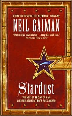
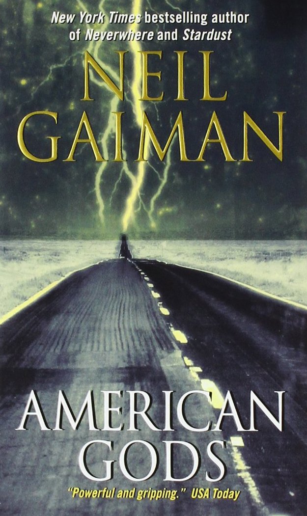
In 1990, Gaiman collaborated with Terry Pratchett (of Discworld series fame) on Good Omens, a comical take on the apocalypse. His first solo novel was Neverwhere, which was a novelisation of a teleplay for a BBC mini-series, published in 1996. Next came the fantasy novel Stardust in 1999, and American Gods in 2001 (and the revisitation to those characters in Anansi Boys in 2005).


But those are just his works geared toward adults. He has also written over a dozen children's books (though he doesn't think of it as writing "for children"). The first was The Day I Swapped My Dad for Two Goldfish in 1997, followed by Coraline in 2002 and many others leading up to this year's Fortunately, The Milk.

I could - obviously - go on about Gaiman for days if Cassy let me, so I'm going to stop there and move on to talking about P. Craig Russell.


Russell is from Ohio and has won the Harvey (for achievement in comic books, named after Harvey Kurtzman) and the Eisner (for creative achievement in American comic books, named after Will Eisner) Awards multiple times each. He is, notably, the first openly gay mainstream comic book creator.

Amazing Adventures 30 (1970).jpg

Like most comic book artists, Russell has done a little bit of everything, and therefore the list of his work would go on forever. One relevant highlight for this week would be the work he did on the Sandman series, illustrating the story "Ramadan" in Fables and Reflections. (He also illustrated one of my favorite stories from Endless Nights, "Death and Venice.") He also has a series called The Ring of the Nibelung (you music buffs are right, that's based on Wagner) which he considers his magnum opus.

You can check out his website here, where you'll find tons of examples of his beautiful work.

Thursday, May 16, 2013

Color & Detail in Graphic Novels

I had a lot of feedback about the layout in graphic novels post for the week we reviewed The Lesser Evil saying that people wanted more like that the next time we covered a graphic novel. So here you go! (I'll  be using a lot of comics as examples this time around, so just go ahead and allow the line to blur between GNs and comics for a little while.)

It's amazing the range of color schemes you get in graphic novels. There's so much more than just the dichotomy of "color" or "black and white."


Stark Black-and-White


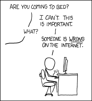
Undoubtedly, the vast majority of you recognize the above-left image as xkcd. You would be right if you corrected my implication that xkcd is always in black-and-white, because yes, sometimes there is color. That's the beauty of webcomics... it costs nothing extra (except a little added time) to post in color as opposed to black-and-white. But when publishing on paper, like with Bone by Jeff Smith (above-right), many artists (or the publishers) choose to work in stark black and white in the interest of saving ink and, therefore, money. Beyond the issue of money or time, though, many artists choose to work in black-and-white in order to focus on the message. Instead of being distracted by pretty backgrounds and detailed drawings, the reader pays more attention to what is being said.

Shaded Black-and-White (Grayscale)


Grayscale is often referred to as black-and-white, because that's basically what it is, but with more shading options, while still saving money on printing costs. The above-left image from Megatokyo is a prime example of grayscale; the only ink being used is black, but in different saturations to allow the artist to reflect that things are different colors, produce more nuanced backgrounds and facial expressions, and create useful images like shadows or demonstrations of distance. It's a softer, more complex version of black-and-white. This is the style our review book, Blankets, (pictured above-right) is drawn in.

Black and White With SOME Color


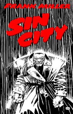
I didn't even have to think hard to come up with the example for this coloring style. Frank Miller's Sin City is the epitome of this style, to the point that it was vitally important that the film recreate it, or it would have been an enormous flop. This style is great for accentuating important parts of a scene. It's been a while since I picked up Sin City, but I'm quite sure blood featured prominently, and to emphasize it, what do you do? Print it in red, with nothing but black and white on the rest of the page. Ingenious in its simplicity, really.

Basic Color


This is probably the most common style of coloring for comic books, particularly older ones. It's more expensive than black & white to print, but it allows more diversity in the illustrations. You can tell what color clothes, hair, walls, signs, food, animals are supposed to be. It helps differentiate between characters (wait, is Archie in love with the blonde one or the black-haired one?) But it isn't as complicated to accomplish as...

Complex Color


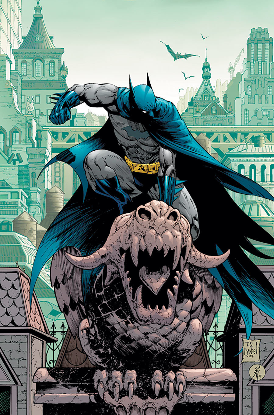
The difference between basic color and complex color is the same as the difference between stark black-and-white and grayscale. This has more shading, and more color choices (instead of just primaries and secondaries, you have tertiaries and beyond) which allows for more nuances, more details, and more epic-looking views like the one above.

Perhaps Batman isn't a fair choice, since he used to be illustrated in basic color. Which brings me to a good point...

Evolution


From left to right, those covers appeared in 1963, 1990, and 2005. You can clearly see the art getting more complex and detailed. Usually when you see this, you can attribute it to improvements in technology. You won't find advanced CGI in 1960s comics because the techniques and equipment didn't exist yet. In the superhero genre, you can also chalk up this trend partly to the fact that the gritty reboot is so prevalent. Darker, scarier, and deeper is the way of the superhero now. This can be accomplished with more complex (albeit darker) color palettes and more detail in facial features, wounds, backgrounds, weaponry, etc.

QC Classic Posters: Cast (Limited!)QC Dungeons & Dragons Print

These two images are from the merch store for Questionable Content by Jeph Jacques, one of my favorite webcomics. Sometimes a change in style is due to improvement of the artist's abilities as they get more practice and try new things. You can see a clear difference from Jacques' style in his older work (left) to his newer stuff (right). Some of this is also due to improved technology (I remember there being a significant shift in style when he bought a new drawing pad for his computer). More detail, more shading, more colors.

Monday, May 13, 2013

Author Bio: Craig Thompson

This week, we're reading Blankets, an autobiographical graphic novel by Craig Thompson.


Born in Michigan in 1975 and raised in Wisconsin with a brother and sister, Thompson grew up in a fundamentalist Christian family, where all media was heavily censored or banned by his parents. He was, however, allowed to read the comics in the paper, which is when he probably grew to love the comics medium.

When he went to college at University of Wisconsin - Marathon County, he produced a comic for the school's paper, solidifying his love of comics. He switched to the Milwaukee Institute of Art & Design for a semester, then moved to Portland, OR.

Thompson worked at Dark Horse Comics for a while, creating ads, logos, and packaging for toys, and he worked on personal projects in his spare time. He developed tendinitis, and left DHC to focus on his personal work.


His first published book was the semi-autobiographical graphic novel Goodbye, Chunky Rice, in 1999. Later that year, he began work on Blankets, which was published in 2003. Blankets is also autobiographical, serving as a tool to explain to his family that he was no longer a Christian. It was a huge hit, which Thompson partially credits to the fact that he wrote something that was neither a punch-em-up action hero comic nor cynical and nihilist, two things the graphic novel and comics market was absolutely saturated with at the time (and, in my opinion, continues to be today, to a slightly lesser degree).


In 2004, Thompson published Carnet de Voyage, a travelogue and collection of sketches from a trip to France. Then he began work on Habibi, published in September 2011. Habibi is set in a beautiful Islamic fairytale landscape, telling a love story and also acting like a parable. It has been met with a great deal of praise, but also with controversy, mostly because of its frankness about sexuality and its treatment of Arab culture, calling Thompson's use of Arabic without fully understanding it "cultural appropriation."


He is currently working on Space Dumplins, to be released in 2014. He calls it an all-ages book that he wants to work like a Pixar film (something for everybody). To see what else he's up to, or to read more about him and his work, check out his website: dootdootgarden.com

Wednesday, February 27, 2013

Favorite Illustrators

Because we're reviewing a graphic novel this week, we wanted to share our favorite illustrators with you:


Art for Sandman: Preludes and Nocturnes
Mine is Dave McKean, which should surprise approximately nobody. He did a great deal of the illustrations for the Sandman series by Neil Gaiman, among other projects with my favorite author (including the children's books The Day I Swapped My Dad for Two Goldfish, The Wolves in the Walls, and Crazy Hair, plus covers for Coraline and The Graveyard Book).


McKean also directed one of my favorite movies, Mirrormask (another project where he collaborated with Gaiman), and I think of it as a fantastic example of his style. He was also a concept artist for the TV mini-series version of Gaiman's Neverwhere, and two of the Harry Potter films (Prisoner and Goblet).

I think I admire McKean's work because it's something I can't do. Collage-type images are beyond the scope of my graphic skills, and his color schemes are usually the kind I would never come up with myself. There's also an antiqued-looking quality to his images that I prefer not to understand... just to enjoy.

Unlike Alex, I'm not super obsessed with illustrations (though, I DO enjoy them.)  I do have a favorite, however, but mainly because of one book.


Brian Selznick does some astounding things with illustrations.  I love the black and white pencil drawings in this book, and it's so detailed and amazing.  Not to mention, he essentially tells the entire story with illustrations, no easy task.  To be so talent as to be able to get your point across with nothing but pictures... well, that takes a certain amount of Awesome that Brian Selznick has.

He's also done a book with David Levithan, a book I feel that I need to get my hands on because, come on.  Selznick's genius with art and Levithan's genius with words will just make the book, well, genius.

Selznick was an illustrator way before he ever started writing books.  And, he really hasn't written that many.  Though I've only read Hugo, it's not a book that's big on the words.  But that's entirely part of its appeal.

Really, I just think that his abilities with a pencil are unparalleled.  They're detailed and real and capture specific moments.  Often times in Hugo, you feel as if you're right there, looking into the scene.  The illustration on the left has the same appeal.  It's from a book called "The Doll People" and the pictures makes you feel like it's YOUR fingers holding that small book open, that you're looking down at this small dolls head.  His illustrations feel like literal windows into this world he's creating.


See?  Doesn't it feel like you're looking right into that room?!

Mostly I just admire him for doing something that I could never possibly do.  I have little to no talent when it comes to drawing and I love how easily he draws you into the pictures.