It's amazing the range of color schemes you get in graphic novels. There's so much more than just the dichotomy of "color" or "black and white."
Stark Black-and-White
Undoubtedly, the vast majority of you recognize the above-left image as xkcd. You would be right if you corrected my implication that xkcd is always in black-and-white, because yes, sometimes there is color. That's the beauty of webcomics... it costs nothing extra (except a little added time) to post in color as opposed to black-and-white. But when publishing on paper, like with Bone by Jeff Smith (above-right), many artists (or the publishers) choose to work in stark black and white in the interest of saving ink and, therefore, money. Beyond the issue of money or time, though, many artists choose to work in black-and-white in order to focus on the message. Instead of being distracted by pretty backgrounds and detailed drawings, the reader pays more attention to what is being said.
Shaded Black-and-White (Grayscale)

Grayscale is often referred to as black-and-white, because that's basically what it is, but with more shading options, while still saving money on printing costs. The above-left image from Megatokyo is a prime example of grayscale; the only ink being used is black, but in different saturations to allow the artist to reflect that things are different colors, produce more nuanced backgrounds and facial expressions, and create useful images like shadows or demonstrations of distance. It's a softer, more complex version of black-and-white. This is the style our review book, Blankets, (pictured above-right) is drawn in.
Black and White With SOME Color
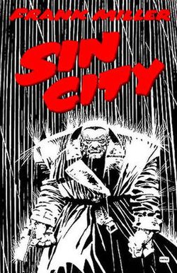
I didn't even have to think hard to come up with the example for this coloring style. Frank Miller's Sin City is the epitome of this style, to the point that it was vitally important that the film recreate it, or it would have been an enormous flop. This style is great for accentuating important parts of a scene. It's been a while since I picked up Sin City, but I'm quite sure blood featured prominently, and to emphasize it, what do you do? Print it in red, with nothing but black and white on the rest of the page. Ingenious in its simplicity, really.
Basic Color

This is probably the most common style of coloring for comic books, particularly older ones. It's more expensive than black & white to print, but it allows more diversity in the illustrations. You can tell what color clothes, hair, walls, signs, food, animals are supposed to be. It helps differentiate between characters (wait, is Archie in love with the blonde one or the black-haired one?) But it isn't as complicated to accomplish as...
Complex Color
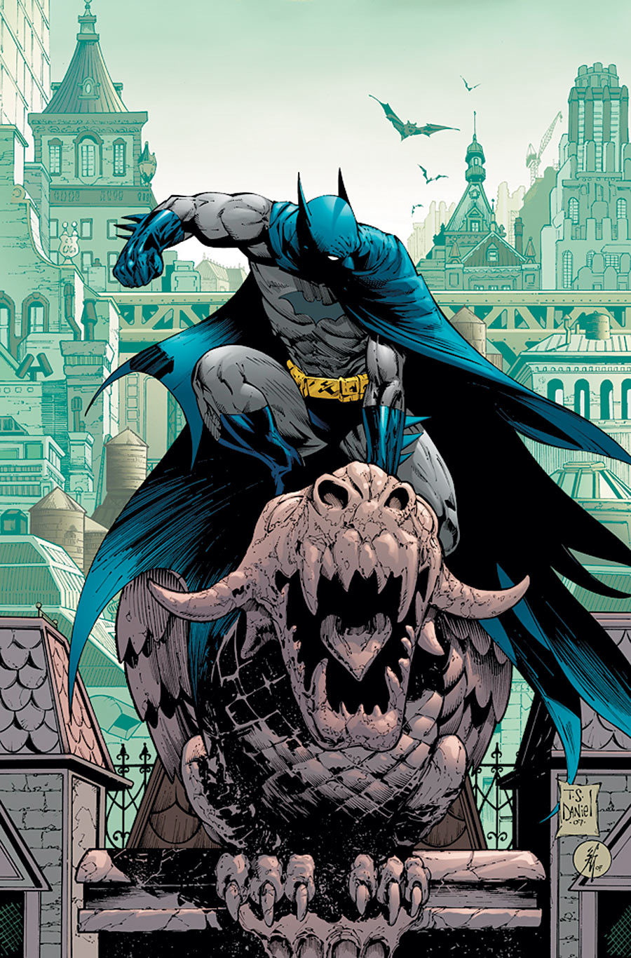
The difference between basic color and complex color is the same as the difference between stark black-and-white and grayscale. This has more shading, and more color choices (instead of just primaries and secondaries, you have tertiaries and beyond) which allows for more nuances, more details, and more epic-looking views like the one above.
Perhaps Batman isn't a fair choice, since he used to be illustrated in basic color. Which brings me to a good point...
Evolution


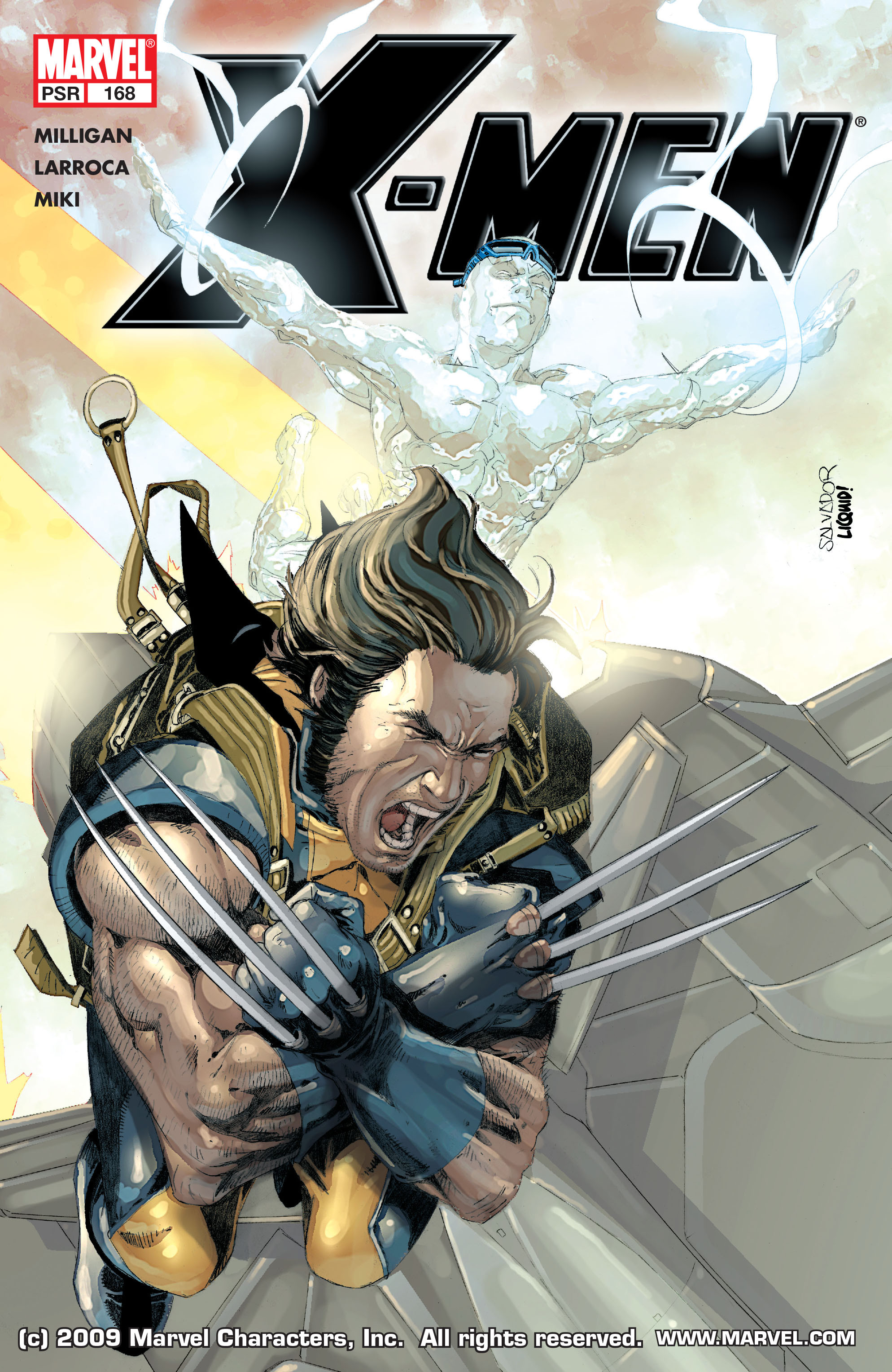
From left to right, those covers appeared in 1963, 1990, and 2005. You can clearly see the art getting more complex and detailed. Usually when you see this, you can attribute it to improvements in technology. You won't find advanced CGI in 1960s comics because the techniques and equipment didn't exist yet. In the superhero genre, you can also chalk up this trend partly to the fact that the gritty reboot is so prevalent. Darker, scarier, and deeper is the way of the superhero now. This can be accomplished with more complex (albeit darker) color palettes and more detail in facial features, wounds, backgrounds, weaponry, etc.


These two images are from the merch store for Questionable Content by Jeph Jacques, one of my favorite webcomics. Sometimes a change in style is due to improvement of the artist's abilities as they get more practice and try new things. You can see a clear difference from Jacques' style in his older work (left) to his newer stuff (right). Some of this is also due to improved technology (I remember there being a significant shift in style when he bought a new drawing pad for his computer). More detail, more shading, more colors.
No comments:
Post a Comment