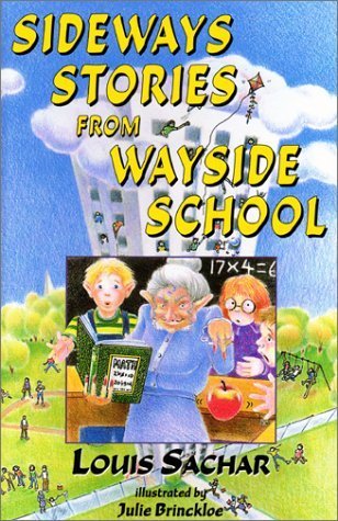
I like this cover because it's very cartoony, which I think really fits the book. It's a silly, ridiculous, non-sensical book, so I think the cover really reflects that by making it that colored in look. And it gives you some basics about the book. The cover reflects the first story, with the teacher that would transform them into apples.
You can also see the school in the background, which is SO TALL that it's reaching the clouds. It's over-exaggerated, just like the entire book is. The cover also has bright colors, which really draw your attention. I think the yellow font is probably my favorite.
Overall, a good cover for the book.
There have been several covers for this book, but they all have the same general feel: cartoonish, fun, weird. And that's what this book is.
No comments:
Post a Comment