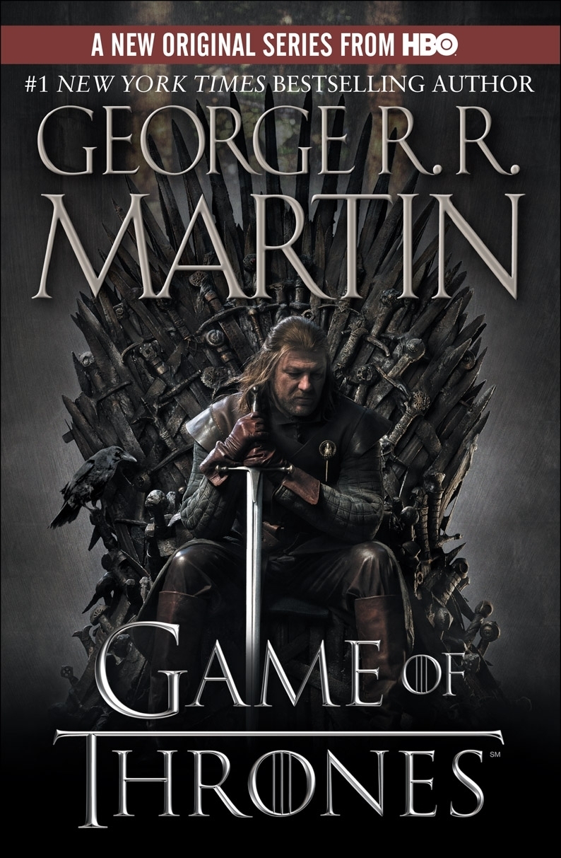
I find it harder to form a critical opinion of a cover when it's ubiquitous. Even if you haven't watched the show or read the book, you've probably seen this cover.
At first, I found it distracting, because I'm a huge fan of the Peter Jackson Lord of the Rings trilogy, so all I saw was Boromir sitting on a scary-looking chair. When I started reading, I had to verify with someone who had read the book that Sean Bean was Eddard Stark, because otherwise, I was going to spend every page wondering.
That said, I think this image encapsulates the story very well. Much of the book is spent discussing all the reasons Ned Stark should have an expression like this: his family's problems, his new position, difficult decisions, etc.
The titular throne is imposing and dark and kind of terrifying (not to mention uncomfortable, as Robert himself admits - both literally and figuratively) and it's a great symbol of the story.
Before HBO picked it up, the cover of this book looked like this:

Still accurate, but not as effective. This cover says to me, "There are swords in this book, like in most fantasy. Enjoy." There isn't much there.
And I also agree that the "TV Cover" gives us a little more to go on. All the shit hits the fan for Ned in the first book, and he looks exactly like that in the "TV Cover."
However, and this is probably something that most of you don't care about, I usually hate the "Movie Cover" for books (because, let's face it, it's usually a movie that the book has been made into.) I like the original covers, especially for a series because none of the other covers in GoT have been changed! So my books won't match up and, aesthetically, that's just not ok with me.
I really don't have a desire to see the actors on my cover either. The actors aren't a part of the book, they're a part of the movie/tv show. And while I can appreciate both, I don't like it when they mix.
---
It's not too late to enter to win a free paperback copy of Game of Thrones! Check THIS POST for details. Entries are being counted until midnight tonight!
It's not too late to enter to win a free paperback copy of Game of Thrones! Check THIS POST for details. Entries are being counted until midnight tonight!
Weird...I've never seen the blue cover before. The actual original cover of the book looks like this:
ReplyDeletehttp://1.bp.blogspot.com/-RbitYU4m07g/TjJUeYHElLI/AAAAAAAAAko/tLa-LPHGI6k/s320/A+Game+of+Thrones+-+Book+Cover.jpg
Lannister gold with a Stark direwolf. More descriptive than a sword. Not really all that pretty. I like the HBO cover...but I more kind of feel like the first one should have just been better.
Apparently the first edition, which came out in 1996, looks like this: http://upload.wikimedia.org/wikipedia/en/9/93/AGameOfThrones.jpg
The iron throne. Much better...but ugly.
Even though my first book is an eBook, my others are hard copies and just variations of that blue cover (the second one is yellow/gold, third one green, fourth red.) They're very similar to the fifth book (the white cover.)
DeleteHere's a image of the books covers that I have:
http://barkingbookreviews.com/wp-content/uploads/IceandFire.jpg