First Impressions.
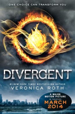
Wow! That looks exciting! There's fire, obviously, and it's swirling around. Plus there seems to be a storm coming, to a metropolitan city that must be just bustling with people. I'm entirely stoked! Let's read this!!!
Even without knowing it beforehand, I would say that this looks like a YA dystopia. (That might have something to do with the similarity to the mockingjay pin on the cover of Hunger Games.)
Even without knowing it beforehand, I would say that this looks like a YA dystopia. (That might have something to do with the similarity to the mockingjay pin on the cover of Hunger Games.)
This cover intensely reminds me of The Hunger Games. The fire and the symbol make me think that someone is just going to jump into some terribly horrific version of the Olympics.
After Reading.
The book did have some Hunger Games like moments, but at the same time, wasn't like it at all. While the book (whose cover makes you pretty much assume you're reading a dystopia) does reflect a dystopian society, it did not have anything to do with games. However, I'm fairly certain that the symbol on the cover is the symbol of the faction that Tris joins, which I like. It matches her faction and it gives you a little more information that you may not have gotten otherwise.
I agree that the flames symbolize Tris's faction choice, but if I had been asked to design a cover for this book, I would have fixated on the idea of using her tattoos, or perhaps the symbols of all five factions. I like this, though; it's immediately recognizable, and it makes good sense.
No comments:
Post a Comment