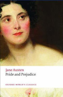
This is the cover of the version of Pride and Prejudice that I read. It pretty much sums up the book, as far as I'm concerned. There's a lady, presented as she would have been in the early 1800s, probably meant to be Elizabeth. Ta-da! That's the story.
Okay, maybe not. But if you try to include any more of the story on the cover, you're going to run out of room. Sure, Mr. Darcy is arguably the next-most-important character and you could put him on the cover with her (as the films seem to do) but that gives away important details (that everyone knows anyway because this is a classic).
There isn't intrigue or anything to pique one's interest on this cover... But there doesn't have to be. This is England's favorite book; it doesn't need any help being sold.
I agree with Alex. My cover wan't much different (it had a BUNCH of early 1800s ladies sitting on a couch), but my cover was the anthology, so it makes sense that there's more than one girl; there's more than one book in my book.
If you put too many people on the Pride & Prejudice covers, you will give away a lot and, let's be honest, everyone pretty much knows what happens. The book is 200 years old. We don't need to be enticed by the cover because, chances are, we're not picking this book up because the cover looked interesting.

No comments:
Post a Comment