So, there's not a lot of ambiguity in this cover. I knew before I read it that it was a retelling of the Cinderella story. I also knew that Cinderella was going to be a cyborg. So the cover is very appropriate: Ghost of a cyborg leg with a red, glass slipper, the most iconic thing from Cinderella.
Honestly, I think the cover is great. It's interesting and, if you didn't know what the book was about, you could probably gather it from the shoe, cyborg leg and title, Cinder. I like books that give you a straight forward look at their books with the cover.
On one level, I agree entirely with Cassy that it is very clear what this book is about.
On another level - the kind you get from glancing at the book as you walk past the shelf - it feels completely different. The color scheme is everywhere right now in teen fiction (perhaps partially due to the popularity of the Twilight series) and fonts like that are also everywhere, covering the entire gamut of supernatural, sci-fi, and fantasy.
Despite the fact that the color scheme, the lighting, and the fonts are just everywhere, this is still a unique cover. Instantly recognizable, very clear (like Cassy said), and nice to look at.
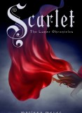
The sequel, Scarlet, looks like this:

So they go together quite nicely. (Is it just me, or does it look like we're wandering into Little Red Riding Hood territory with this one? Hmm...)
No comments:
Post a Comment